CSS bugs come in a small number of shapes. Once you can recognise which shape you're looking at, most of them take a minute instead of an hour. This is a tour of the common ones, with the diagnostic move for each.
"My CSS isn't applying"
Nine times out of ten the rule is applying and something else is overriding it. Select the element, open the Styles pane in DevTools, and look for your declaration with a strikethrough. If it's struck through, you have a specificity or order problem. If it isn't there at all, the rule never matched.
It's there but struck through
Something more specific won. Specificity is counted as three numbers: IDs, then classes/attributes/pseudo-classes, then element/pseudo-element selectors. A single #id beats any number of classes. Inline style="" beats all of them. !important beats everything except another !important later in the cascade.
/* 0,1,0 */
.button { background: blue; }

/* 0,2,0 — wins */
.card .button { background: grey; }

/* 1,0,0 — wins over both */
#promo { background: red; }
The Styles pane lists rules in winning order, most specific first, so you can read the cascade top to bottom. Computed tells you the final value and, if you expand a property, which rule produced it.
It isn't there at all
Then your selector doesn't match. Common causes:
- A typo in a class name that your build tool happily compiled
- CSS Modules or a scoped-style system rewriting the class to something hashed
- The stylesheet failing to load, which shows up as a 404 in the Network panel rather than as a CSS error
- A syntax error in an earlier rule, which makes the parser skip forward until it finds something it understands
- The element being inside a shadow root, where outside styles don't reach
"There's a horizontal scrollbar and I can't find the culprit"
One element somewhere is wider than the viewport. It's usually an image without max-width, a fixed pixel width in a flex child, a long unbroken string, or a negative margin. Finding it by inspecting elements one at a time is miserable.
The quick console version:
document.querySelectorAll('*').forEach(el => {
  if (el.getBoundingClientRect().right > document.documentElement.clientWidth) {
    console.log(el);
  }
});That gets you a list, but you still have to map each entry back to something on screen. Highlighting the offenders visually is faster: Web Developer Tools has an Overflow Element Detector in its CSS category and an Overflow Detector in Responsive Tools, both of which outline the elements causing horizontal scroll so you can see immediately whether it's the hero image or a stray <pre> block.
"z-index isn't working"
z-index only has meaning inside a stacking context, and it only competes with siblings in that same context. A child with z-index: 9999 cannot escape a parent whose stacking context sits below another one. That's the entire bug, almost every time.
Stacking contexts are created by more things than most people expect:
positionother thanstaticcombined with anyz-indexvalueopacityless than 1transform,filter,perspective,backdrop-filter,maskwill-changenaming any of the aboveisolation: isolatecontain: paintand flex/grid children with az-index
The opacity: 0.99 trick that someone added to fix a Safari repaint three years ago is a genuinely common cause of a dropdown appearing behind a header. To diagnose, walk up the ancestor chain and check the computed values of those properties on every parent. Display Stack Levels and Highlight High Z-Index print the values onto the page, so you can see the competing layers without stepping through the tree by hand.
"The spacing is wrong and I don't know whose it is"
Margins collapse. Two adjacent vertical margins become one margin the size of the larger, and a parent with no padding or border inherits its first child's top margin. The gap you're looking at may belong to an element you haven't considered.
Hover an element in the Elements panel and Chrome paints the box model onto the page: content in blue, padding green, border yellow, margin orange. That colour overlay answers "is this padding or margin?" instantly, which is the question you're actually asking.
For every element at once rather than one at a time, the Margin Inspector, Padding Inspector and Spacing Inspector paint the same information across the whole page, and Display Div Dimensions stamps rendered sizes onto every block.
"It looks broken and I can't tell if it's my CSS or the content"
Turn the styles off. All of them. A page with no CSS shows you the raw document order and the real content hierarchy, and a surprising number of layout bugs turn out to be markup bugs wearing a stylesheet.
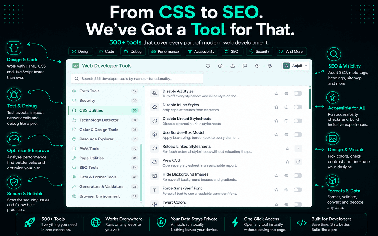
Disable All Styles does this in one toggle, and there are narrower versions when you want to isolate a source: Disable Linked Stylesheets leaves inline styles running, Disable Inline Styles strips style attributes, Disable Embedded Styles kills <style> blocks. Flipping them one at a time tells you which layer owns the problem.
Flexbox and grid: read the container, not the child
Most flex and grid confusion comes from debugging the wrong element. If items won't wrap, that's flex-wrap on the container. If an item overflows instead of shrinking, that's usually min-width: auto on the item, which is the default and which most people have never set explicitly.
/* The classic flex overflow fix */
.flex-child {
  min-width: 0;      /* let it shrink below its content size */
  overflow-wrap: anywhere;
}
Chrome marks flex and grid containers with a small badge in the Elements panel; clicking it draws the lines, gaps and track sizes over the page. The CSS Grid Inspector and Flexbox Inspector in WDT outline every container at once instead, which is what you want when you're trying to understand a layout you didn't write.
Fonts, and why text jumps
If text reflows a beat after load, a web font swapped in and its metrics differ from the fallback. That's a layout shift, and it counts against CLS.
To see how much of the layout depends on the custom font, force everything to a system sans-serif and compare. That's what Force Sans-Serif Font does. Font Fallback Viewer answers the related question: which font actually rendered, versus what the stack asked for. It catches the case where your carefully chosen face never loaded at all.
A debugging order that works
- 1Reproduce it at a specific viewport width and write the width down
- 2Inspect the element that looks wrong, not the section around it
- 3Read the Styles pane top to bottom and find the winning rule
- 4Check the ancestors for
overflow,position,transformand stacking contexts - 5Disable stylesheets by source to find which layer owns the rule
- 6Only then open your editor
The reason to work in the browser first is that you get a confirmed fix before you change any code. Editing CSS live and watching the page respond is far quicker than a save-and-rebuild loop, particularly on a large app.
Related reading
If the bug only shows up at certain widths, it belongs in responsive testing rather than general CSS debugging. If you'd rather get more out of the browser's own tooling first, the DevTools tips collection covers the shortcuts that speed this up. And when the layout is fine but the structure underneath isn't, start with inspecting the HTML.